
Recently, I received an interview invitation from the Senseable City Lab at the Massachusetts Institute of Technology (MIT) for a position in data visualization. This came as a surprise because, although I had heard of data visualization, this position required a deep mastery of Geographic Information Systems (GIS) data visualization skillset—a field I had almost never touched. As the interview approached, I increasingly felt the need to have a real data visualization project to make the 15 minutes meaningful, or at least to have something substantive to discuss. With less than 24 hours to go before the interview, I decided to challenge myself to quickly learn and attempt to create a simple project.


I made it, and was able to present my project successfully during the interview. The interviewer, Fábio Duarte, told me he really liked this project I made. Although they continue to look for candidates with extensive professional experience, I believe that this attempt to push myself was a significant achievement in its own right. In both career and life’s journey, there will undoubtedly be numerous moments like this—responding swiftly in unfamiliar territories, which requires an open mindset for learning, as well as a combination of flexibility and creativity.
Learning Journey
Lacking a background in this field, I initially didn’t know where to start. However, I knew I could piece together the necessary information through careful research. Thus, my learning journey began with searching to understand what could be done and how to do it. I also reviewed the job description, which highlighted key skills such as using HTML, CSS, and JavaScript, analyzing and interpreting data, and drawing polygons based on geographical locations. This review helped me make an informed decision about the necessary steps for the project. It also reminded me of my previous exposure to Mapbox during the Nike AR Map project years ago, suggesting that I could use it as a platform for data visualization.

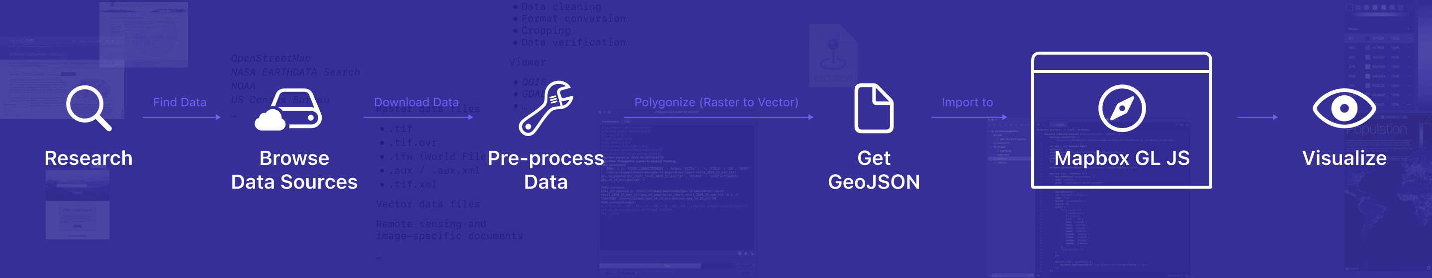
With this in mind, I outlined a basic framework: after collecting the data, the next crucial step would be to process it into GeoJSON format. This format would then be fed into Mapbox GL JS to render the data visually. I anticipated facing many unknown challenges throughout this process, each needing to be addressed one by one.
Technical Implementation Process
Data Collection
Although I had several potential topics in mind, the feasibility of each depended on the availability of relevant data. Therefore, my first step was to explore accessible data sources. I reviewed sites like OpenStreetMap, NASA Earthdata, NOAA, and the US Census Bureau, downloading a large number of data files ranging from a few MB to several GB. I discovered that these raw datasets were stored in various formats, with TIFF files for raster data being the most common, alongside vector data files. Determining which dataset to use required further processing.
Data Preprocessing and Decision-Making
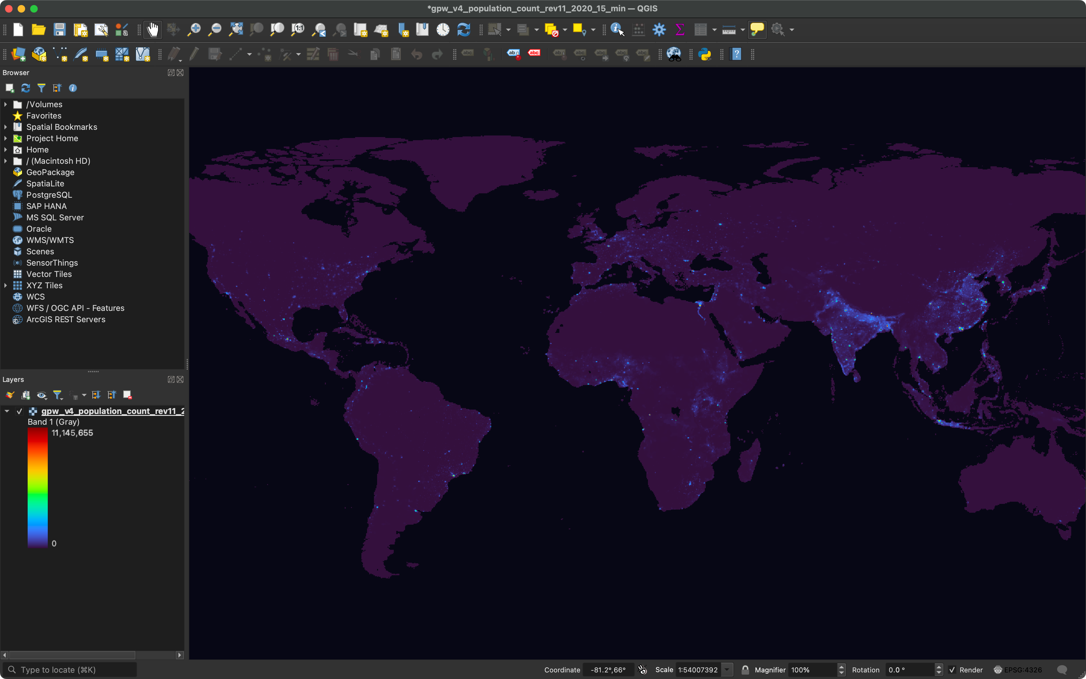
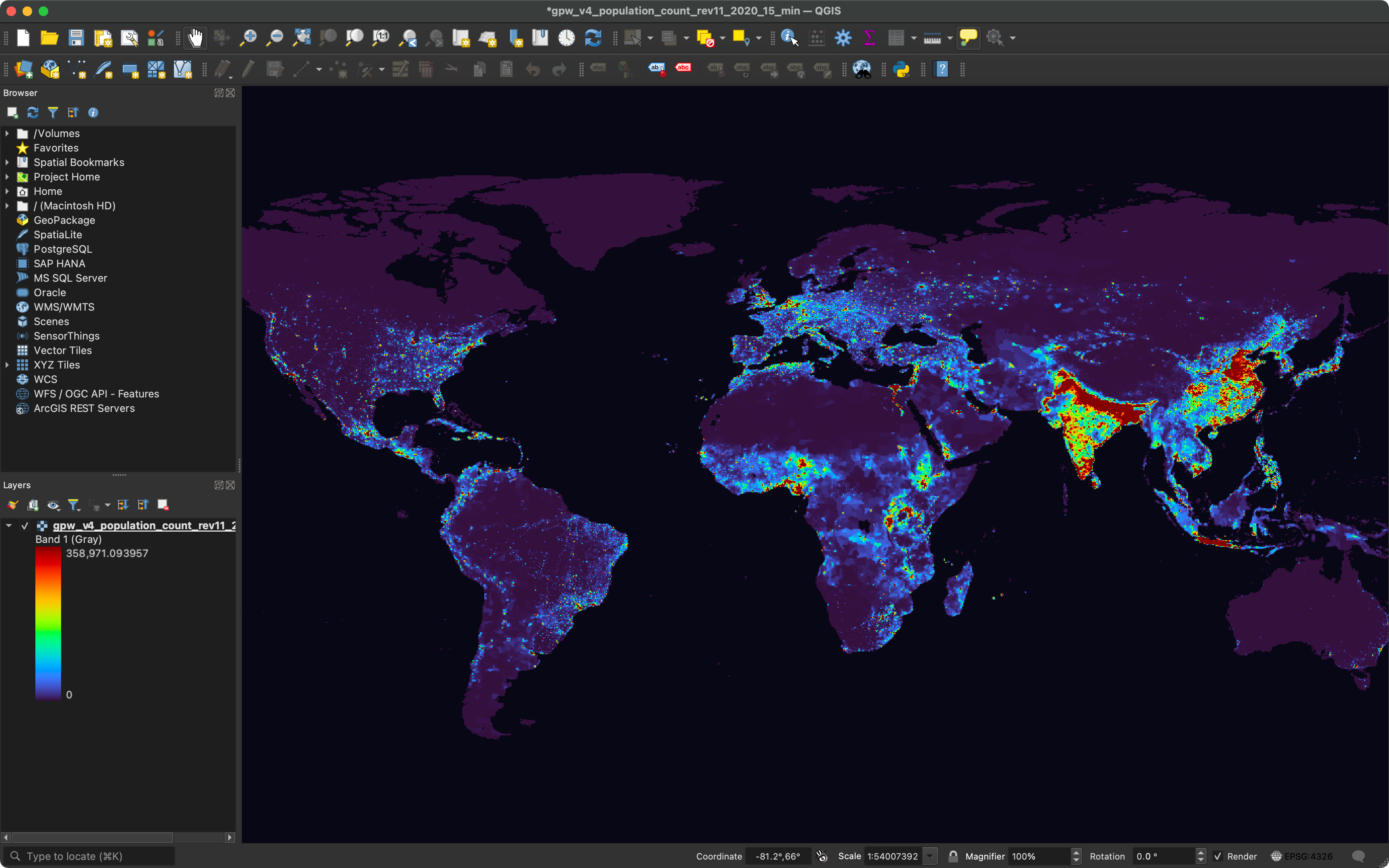
Directly opening TIFF data files often meant enduring long waits due to their large sizes. I realized that specialized software was necessary to process the data and export it as GeoJSON. Further research led me to choose the QGIS app for its no-cost availability. The preprocessing steps potentially included:
- Data cleaning
- Format conversion
- Cropping
- Data verification
While these concepts initially seemed abstract, handling the data within the viewer and performing these tasks made them much clearer. Practical experience brought these abstract concepts to life. I experimented with color-coding the images. When the images transitioned from black and white to color, it felt like I was on the right track. I quickly learned that the choice of color coding was crucial as it needed to convey the correct semantic information. For instance, high values in PM2.5 data should appear as polluted or negative, while low values should seem cleaner; for population data, high values might suggest congestion, and low values a lack of vitality.


I also learned the importance of setting minimum and maximum ranges to exclude extreme data for effective visualization.

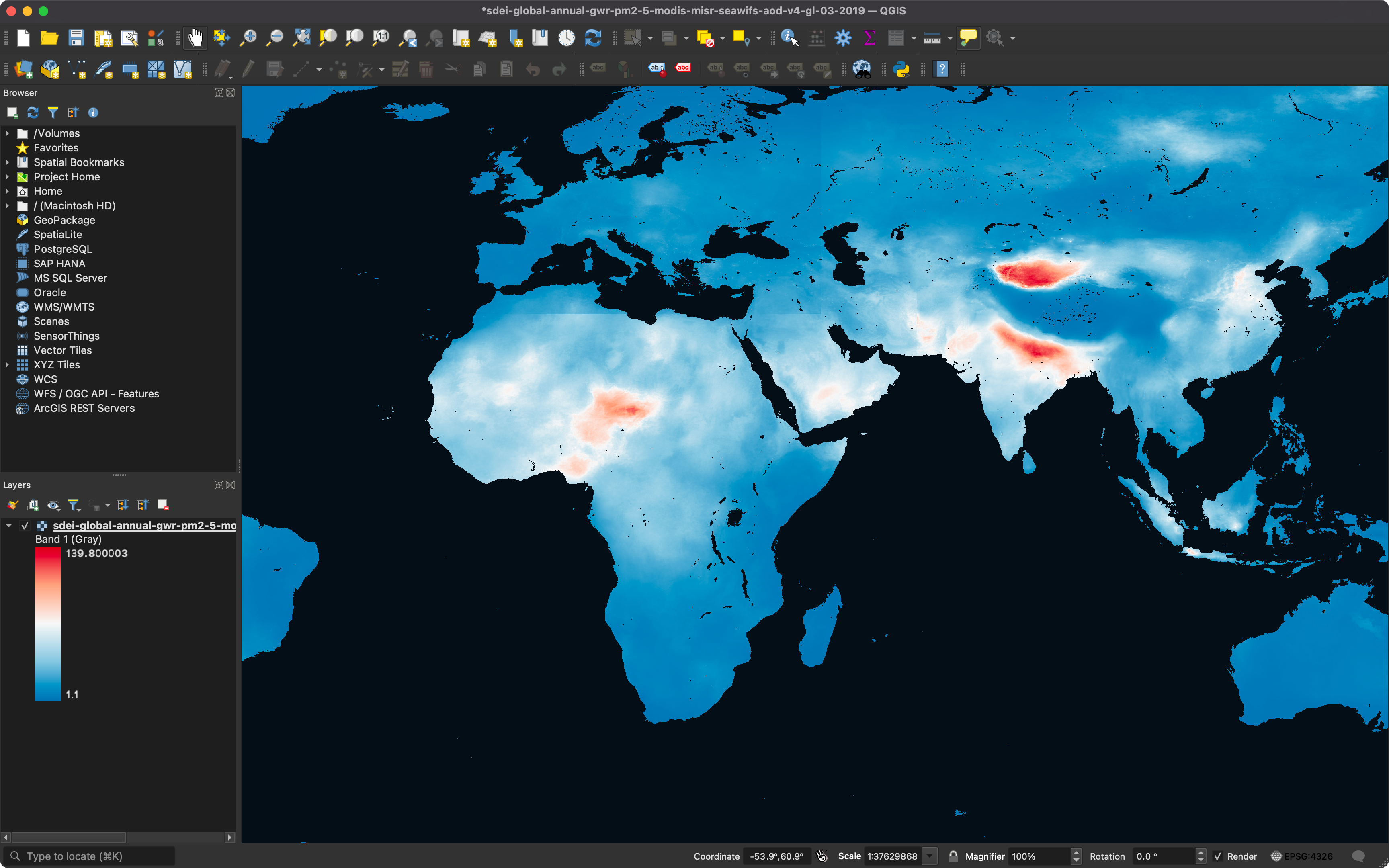

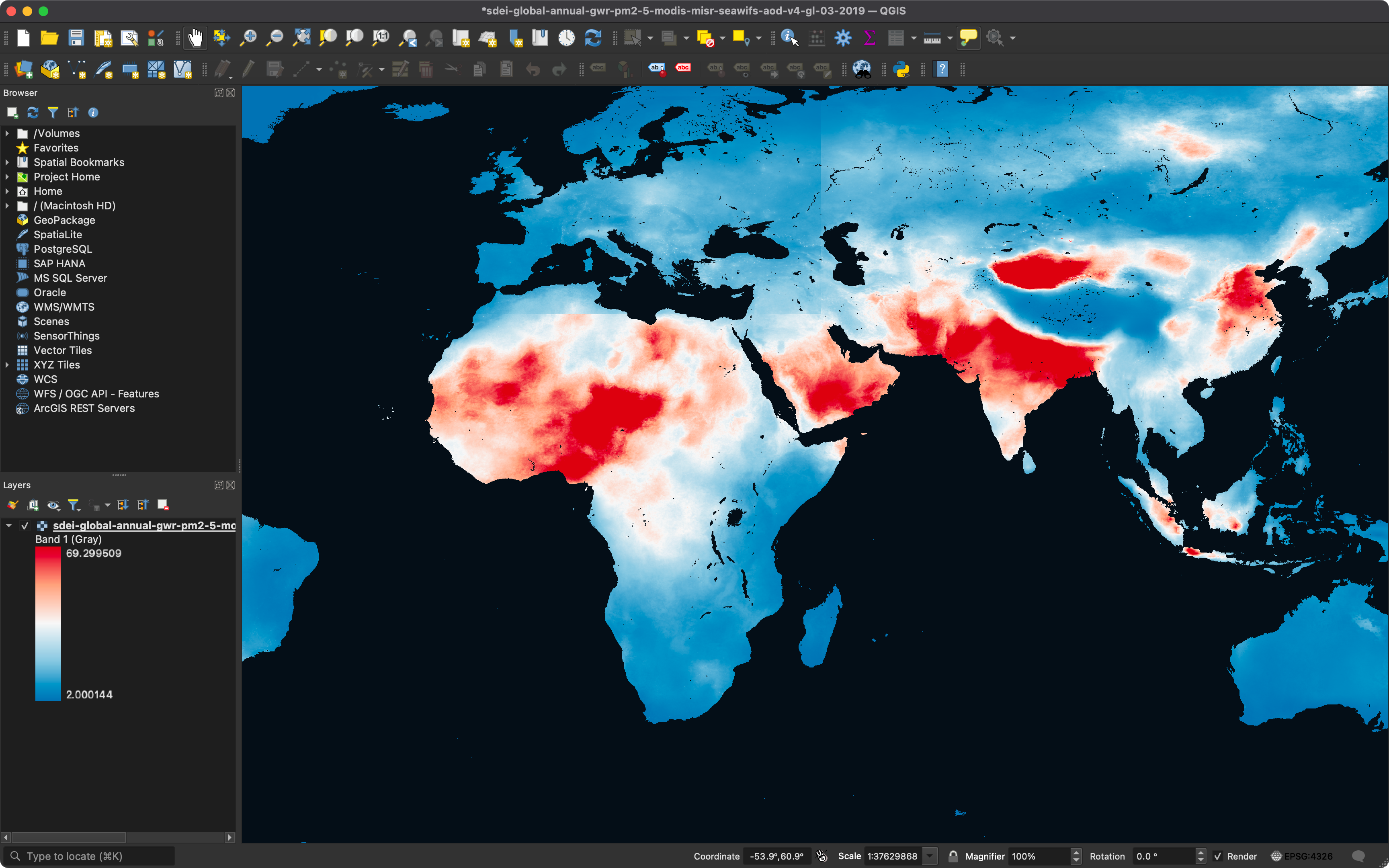


The final step was the polygonization of the data, converting it from raster to vector format—essentially transforming the data into GeoJSON. All I needed to do during this process was wait. Then, I realized that the exported GeoJSON might not be small. Considering I was still experimenting, to keep the GeoJSON manageable, I decided to use population data from NASA Earthdata. This decision balanced the richness of the data and the size of the file.
Coding and Visualization Implementation
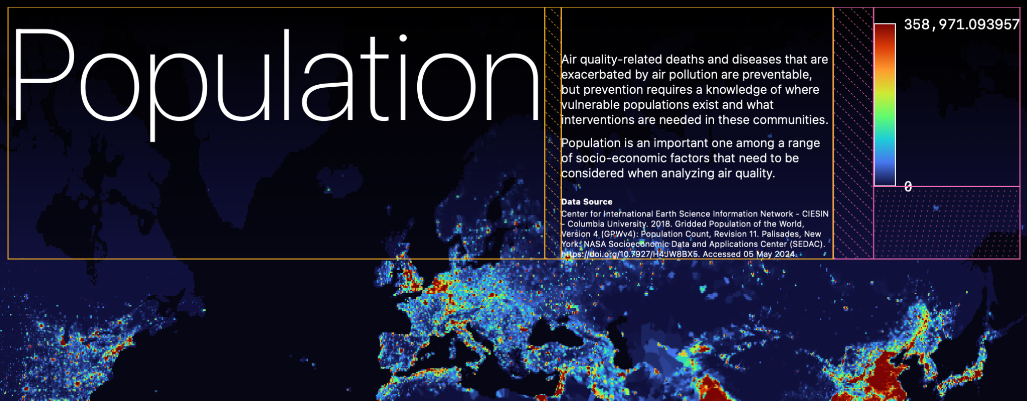
After obtaining a token, I wrote JavaScript to interact with Mapbox GL JS. To ensure the API was called successfully, I started with a very simple GeoJSON of U.S. administrative divisions. Once confirmed, I replaced it with the recently generated GeoJSON file (over 40 MB). Due to the large size of the GeoJSON data, which often required some waiting time, I added a loading indicator to guide users through the wait. Achieving the color coding arranged in QGIS required additional efforts, such as calculating data distribution ranges and extracting color set values. Setting the initial value to 1000 helped me mimic the exclusion of extreme data seen in QGIS. In Figma, I created equidistant graphic aids and used the dropper tool to precisely extract color values.


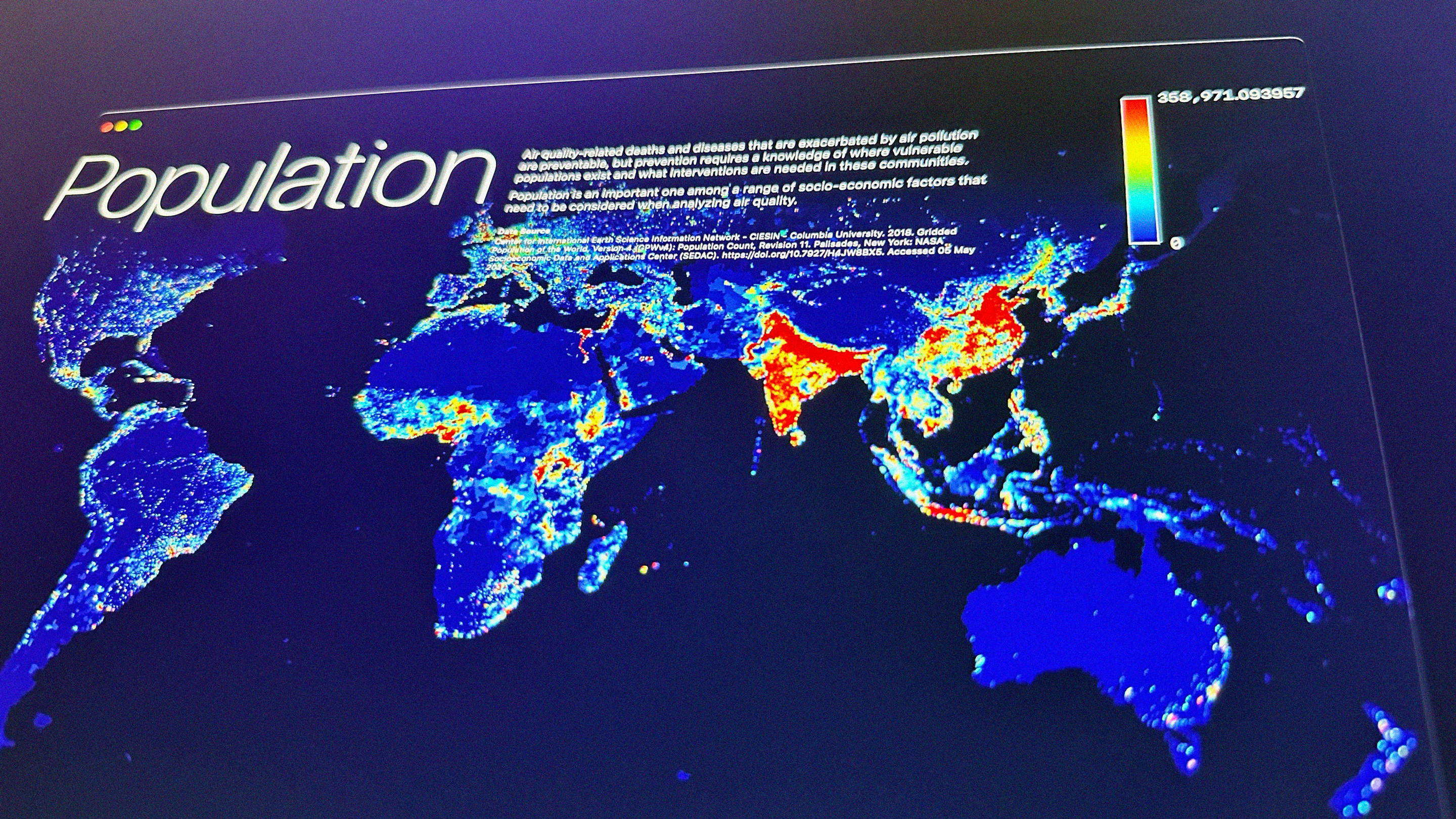
To make the final result more comprehensible and visually appealing, I incorporated additional visual elements such as titles, descriptions, data sources, and legends.

Grand Finale
The project culminated in a static webpage. It was almost unbelievable that I had successfully displayed complex data visually on a web interface.


With more time, I might have integrated additional datasets like poverty indexes, and PM2.5 levels, providing toggle buttons or autoplay features to explore how these factors interrelate.
Conclusion and Reflection
This project enabled me to display global population density distributions on a webpage—an exploration of how air quality impacts diseases as a socio-economic factor. Not only did I enhance my basic GIS skills, but I also learned how to dive into a new field swiftly. Taking the first step bravely in the face of the unknown is crucial. Although I started with a clear intention, I had no expectations for the final result and treated it as an open-ended experiment. Enjoying this process, I embraced the opportunity to attempt and fail, which is essential for open exploration.
References
Center for International Earth Science Information Network – CIESIN – Columbia University. (2018). Gridded Population of the World, Version 4 (GPWv4): Population Count, Revision 11. Palisades, New York: NASA Socioeconomic Data and Applications Center (SEDAC). Link. Accessed 05 May 2024.
Exploratory. (2016). Estimates of the Resident Population for the US States. Retrieved from Link. Accessed 05 May 2024.
Mapbox. (n.d.). API Reference | Mapbox GL JS | Mapbox. Retrieved from Link. Accessed 05 May 2024.
Mapbox. (n.d.). Working with large GeoJSON sources in Mapbox GL JS. Retrieved from Link. Accessed 05 May 2024.
Mapbox. (n.d.). Upload data to Mapbox. Retrieved from Link. Accessed 05 May 2024.
Mapbox. (2017, December 15). Turn static images into interactive maps. Retrieved from Link. Accessed 05 May 2024.
NASA Earthdata. (n.d.). GIS at NASA: Expanding the Understanding of Earth Science. Retrieved from Link. Accessed 05 May 2024.
NASA Earthdata. (n.d.). NASA Earthdata. Retrieved from Link. Accessed 05 May 2024.
National Centers for Environmental Information (NCEI). (n.d.). Data Access | National Centers for Environmental Information (NCEI). Retrieved from Link. Accessed 05 May 2024.
OpenStreetMap. (n.d.). OpenStreetMap. Retrieved from Link. Accessed 05 May 2024.
OpenGISLab. (2018, November 10). Adding and viewing GeoJSON in QGIS and ArcGIS. Retrieved from Link. Accessed 05 May 2024.
QGIS. (n.d.). Symbology properties. In QGIS Documentation. Retrieved from Link. Accessed 05 May 2024.
QGIS. (n.d.). Raster to vector conversion. In QGIS Documentation. Retrieved from Link. Accessed 05 May 2024.
Sobolevsky, D. (2023, March 15). GeoJSON Tutorial for Beginners. Medium. Retrieved from Link. Accessed 05 May 2024.
United States Census Bureau. (n.d.). Census Data. Retrieved from Link. Accessed 05 May 2024.