Structure, Built to Serve: Redesigning the Design System to Earn Cross-team Adoption
Design team size: 10 people
Role: Design System Designer
Year: 2020
Centralization limited experience. A service-oriented approach brought teams together.
At a Glance
8+
Products and tools powered by the system
100%
Team members acknowledged the value of the redesign
80%+
Reduction in page-building time
All Roles
Designers, Engineers, PMs benefited from the redesign
“Chiawei built design systems that not only expressed the brand voice but also defined corresponding workflows for teams to follow. This required deep collaboration and hands-on engineering knowledge, which is quite exceptional.”
— Paula, Head of Design
Background
The first design system, built for team collaboration, needed a redesign.
As our team grew from 2 to 4 (and at one point to 10), I began developing a design system to improve consistency and efficiency.
Team Collaboration Over Time
Initially, with only two designers, we effortlessly maintained visual consistency through casual communication and intuition—no heavy processes needed.
As the team expanded, creating design components became inconsistent: some reused previous designs, others created new ones independently. The lack of a single source of truth led to confusion, frequent misuse, and style inconsistencies driven by personal taste. Additionally, similar components were repeatedly created from scratch, consuming double the time and effort. The once-efficient informal workflow now generated substantial communication overhead.
To tackle consistency and efficiency, I started building a design system, shifting basic design decisions from “person-to-person communication” to “systematic references” through a unified component library and guidelines.
This approach reduced overall communication overhead by having everyone work from a single source of truth (SSOT), minimizing personal bias and duplication.
Design System V1 at a Glance
Coinciding with our team’s migration from Sketch to Figma—a tool enabling components to be placed flexibly—I centralized components, documentation, and guidelines into one file, aiming to reduce the complexity of multiple files.
The centralized documentation combined Figma components, style and interaction guidelines, and frontend development specifications.
The first version standardized components but made the experience somewhat cumbersome. Team members felt something was “off.” Months later, when a product-wide redesign began, I finally got the opportunity to reconstruct the design system, resolving its usability issues.
Problem
From “messy yet smooth,” to “structured but slow.” What was the cost?
Everything looked systematic—but workflows no longer felt natural.
Though documentation was centralized and the architecture unified, different team members faced unique challenges. By observing daily workflows, reviewing Slack discussions, and conducting brief designer interviews, I identified several common pain points:
Junior Product Designers
Unlike experienced designers, juniors often didn’t recall component names and preferred visually scanning the document to identify and copy components. But the complexity of the documentation and high density of information made visual searches difficult—especially when the main components were hidden among numerous variants.
This “unexpected usage pattern” hadn’t been anticipated when building the design system.
Other Product Designers
Experienced designers typically located components via search. However, Figma at that time didn’t support variant grouping, causing multiple similar-looking component states to appear in search results, making identification challenging. The absence of auto-layout features also made dynamic components like buttons difficult to use. Moreover, some components lacked thorough testing, leading to usability issues and frustration.
Design System Designer (Me)
Atomic components improved maintainability but didn’t naturally fit into the narrative structure of documents. While essential for constructing Figma components, their exposure in other contexts often caused confusion. Updates to components frequently required adjustments to descriptions and layouts, resulting in intertwined tasks that lowered iteration speed and enthusiasm.
The system was logically consistent—yet it never quite felt intuitive to use.
Insights
Behind visible symptoms is a web of structural tensions.
These issues weren’t isolated—the challenges users faced ran deeper.
Problems manifested in various roles, but beneath them lay complex interdependencies involving tool limitations, information organization, maintenance overhead, and collaboration misalignments. These tensions intertwined, creating a complex system resistant to simple, linear explanations or quick fixes.
Visible issues were merely symptoms—a glimpse of a deeper structural complexity.
Problems appeared as “difficult to find,” “hard to use,” or “slow to update,” yet the mechanisms that truly disrupted collaboration were hidden behind these surface frustrations.
1. Identifying Factors
Problems in the system stemmed from multiple factors, not only the components themselves but also less obvious aspects like information density, tool constraints, time pressure, experience gaps, and role clarity.
2. Interactions
Problems didn’t exist independently—they created reinforcing loops, where attempts by one group to alleviate an issue inadvertently intensified difficulties for another. The causal relationships weren’t linear; they formed networks. Within such a structure, even minor adjustments could trigger cascading effects, making complexity a product of interactions, not merely volume. Typically, these adjustments were irreversible, leaving little room for trial and error.
3. The Full Picture
Complexity wasn’t an accumulation of details, but a fabric woven from multidimensional relationships. Gigamapping clarified how these factors interconnected and revealed which relationships continually tightened the system’s tensions.
Not a moment of failure, but a cycle of reinforcement.
The Gigamap revealed that problems didn’t exist in isolation. Rather, within a structure lacking timely interventions, individual coping strategies inadvertently amplified existing issues. When users managed their struggles by working around the system quietly, they unintentionally reinforced the problems.
No clear feedback loops, leaving struggles unseen
Junior designers struggled silently, hesitant to ask for help due to shame (regional culture) or fear of disturbing others. With no defined channel for feedback, their difficulties remained invisible, further isolating them.
Document complexity restricted iterations
Inexperienced with designing large systems, we initially chose a single, comprehensive document structure aimed at “everyone.” But the resulting complexity discouraged maintainers from making necessary adjustments, reinforcing structural burdens.
Accumulation of errors left unresolved
Without rapid feedback or correction mechanisms, issues like delayed information and component misuse compounded. This damaged team confidence, fueling frustration, and creating a reinforcing cycle of errors and stress.
Low-quality components became entrenched
Components were released without thorough testing, creating poor user experiences. This generated negative feedback and fatigue among designers, reducing their willingness and confidence to improve, locking quality issues in place.
A one-size-fits-all structure overlooked role differences.
From the feedback loops, it became clear: designing a single document for all roles amplified many issues. While this “all-in-one” structure seemed unified on the surface, it introduced cognitive dissonance—each role searched for their own path through the content but often failed to find what they truly needed.
To better understand these differences, I broke down the components into three layers:
Presentation layer – What it looks like
Implementation layer – How it’s built
Usage layer – How it’s used
I then mapped each layer to the preferences and real-world challenges of three key roles (all target users).
Role / Information Layer
👤 Design System Designers
👤 Product Designers (Junior + Senior)
👤 Frontend Engineers
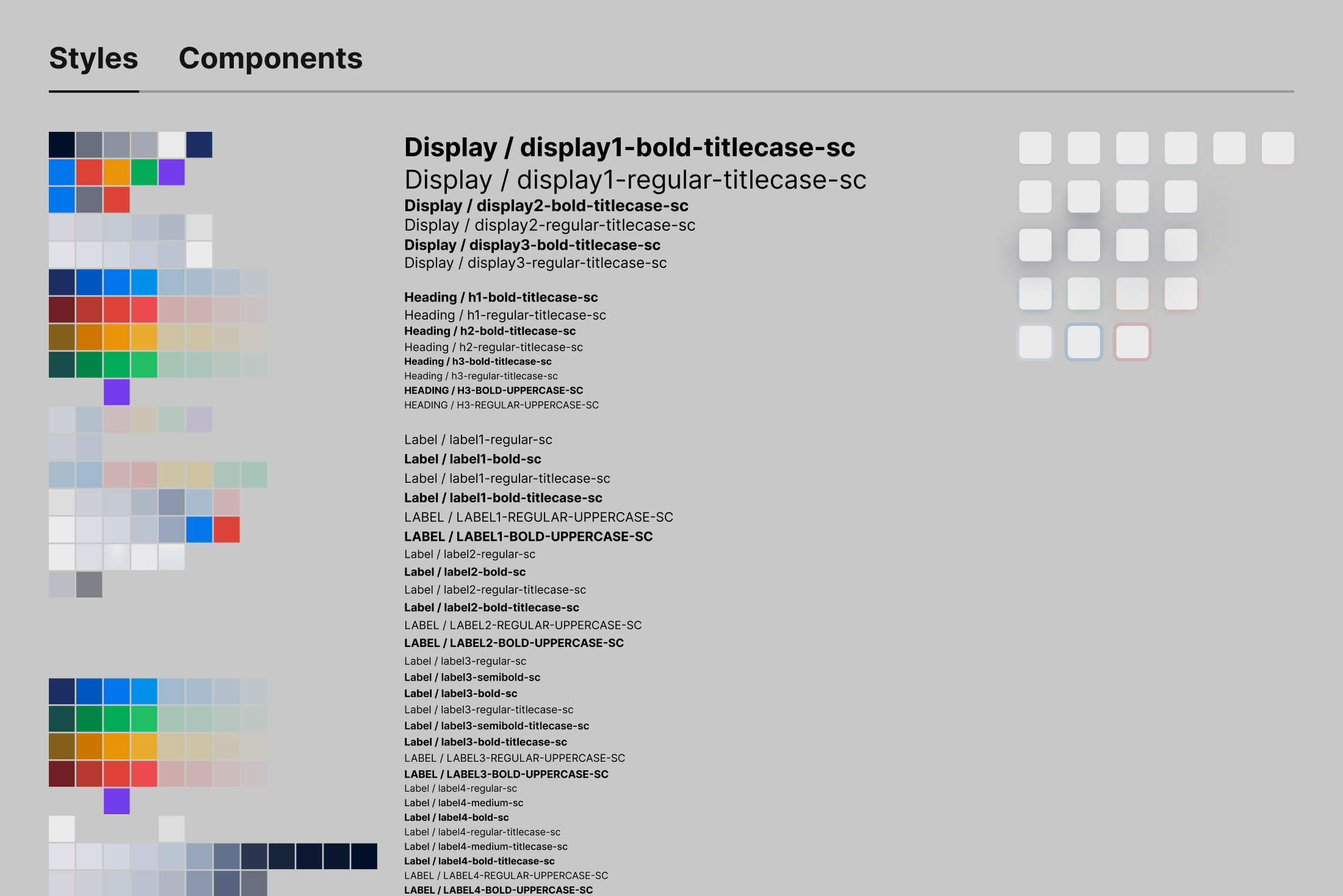
Presentation layer
Focus on complete component states—e.g., hover vs. disabled styles
Care about visual clarity and interaction/brand consistency (e.g., primary vs. secondary buttons)
Ensure accurate visual rendering—e.g., font size, hover effects
Need clarity on structure and data logic—e.g., tab items, menu nesting
Usage layer
Understand use cases to define appropriate variant dimensions (e.g., status vs. category tags)
Expect reliable, ready-to-use component sets with intuitive option names
Depend on clear documentation—examples, edge cases, input validation rules
Define
Structure is strategy. It is the key leverage point for changing system behavior.
A design system is not a static set of rules—it’s a network where behavior is shaped by how information is organized. To shift behavior, we can’t just optimize content; we must intervene at the structural level.
In systems thinking, Donella Meadows proposed 12 leverage points for systemic change. One key leverage point (#6) directly applies here:
The structure of information flows
Who has access to what—and how—can fundamentally reshape collaboration paths and the system experience.
Designing a single document for all roles may appear to promote consistency, but in reality, it conceals role-specific needs and blocks feedback loops. It introduces friction and reinforces delays in adaptation.
To break out of this structural gridlock, redefining information flow became the critical intervention point.
What are leverage points?
The leverage points framework was proposed by Donella Meadows, identifying 12 key places to intervene in a system—ranked from shallow to deep in terms of their impact.
Places to Intervene in a System
Constants, parameters, numbers (such as subsidies, taxes, standards)
The sizes of buffers and other stabilizing stocks, relative to their flows.
The structure of material stocks and flows (such as transport networks, population age structures)
The lengths of delays, relative to the rate of system change
The strength of negative feedback loops, relative to the impacts they are trying to correct against
The gain around driving positive feedback loops
The structure of information flows (who does and does not have access to what kinds of information)
The rules of the system (such as incentives, punishments, constraints)
The power to add, change, evolve, or self-organize system structure
The goals of the system
The mindset or paradigm out of which the system-its goals, structure, rules, delays, parameters-arises
The power to transcend paradigms
How might we — restructure the design system to create clear, role-specific usage paths?
At its core, the goal isn’t to make everyone use the same system—it’s to make the system usable by everyone in their own way.
Deeper Insights
Structure reflects mindset.
When we ask, “How might we create clear usage paths for different roles?”, we’re not just talking about structural design—we’re questioning the very purpose of the system: Why does it exist? And who is it really for?
In classic design research frameworks, this question can be placed on a two-axis grid.
The first version of the design system sat in the Expert × System quadrant—logically complete, but difficult to use intuitively. The redesign wasn’t about decentralization or “everyone can edit,” but rather about shifting: – Horizontally, toward collaboration with users. – Vertically, toward a system that adapts to people.
This reflects a deeper shift in the system’s leverage point—#2: changing the mindset or paradigm on which the system is built.
The result was not just a structural revision, but a repositioning: from delivering a product to providing a service.
A design system shouldn’t be a space of rigid rules for all—it should be infrastructure that supports each role in their own way.
Restructure
Structural change enables systemic improvement.
System-centric and human-centric design don’t have to be a trade-off.
In rebuilding the design system, I preserved its internal logic and coherence while also addressing the real-world needs of its users. The result was a dual win: a system that is both rigorous and usable.
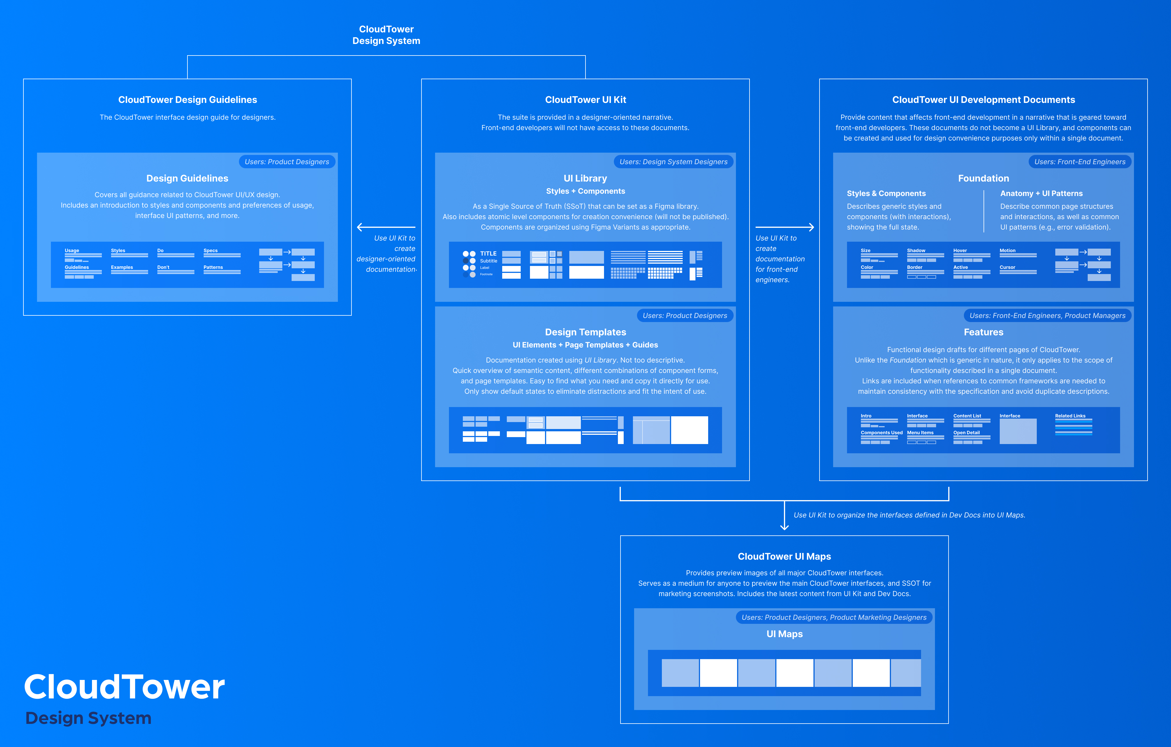
By redefining the relationships and purposes of core documents, I reshaped the information flow—allowing the system to support complex collaboration and serve the distinct needs of each role.
Structure shapes attention. And attention shapes the quality of work.
To support component creation, quick reuse, and design consistency, the original document was split into three focused documents—each aligned with specific responsibilities.
This helped every role stay focused, instead of getting lost in an information maze.
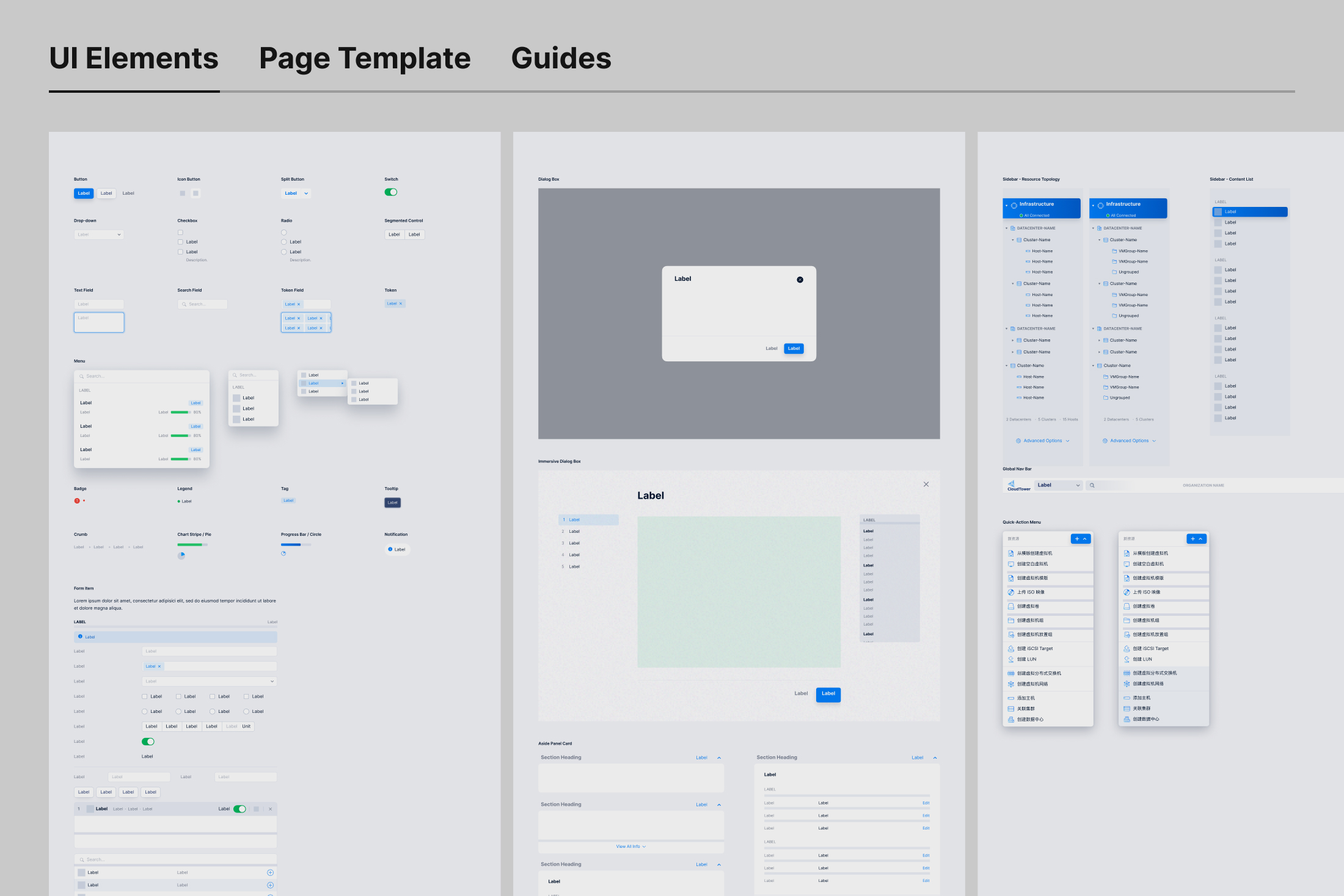
A collection of UI elements and page templates, built from the UI Library. Only common default states are presented (with variant customization still available). Product designers use this to:
Visually locate and copy components without the clutter of documentation.
Link out to Design Guidelines for further specs.
Copy full page templates to avoid starting from scratch.
View examples of spacing and padding for forms.
Work with stable components without being affected by live updates.
Design Guidelines
A shared expression of design language and interaction principles, collaboratively written by product designers. Components from the UI Library are used as reference examples. Product designers use this to:
Understand the rationale and consistency behind the visual language.
Self-check visual and interaction alignment.
Make better-aligned decisions when designing new pages.
This structural split broke multiple feedback loops. It became the most critical step in overcoming systemic friction within the team.
Beyond the Core
The edges define how far design can reach.
Design doesn’t end with visuals—it continues through how intentions are interpreted, implemented, and communicated. To support this, I extended the system structure to cover development, product, and marketing touchpoints.
UI Development Documentation
Provides frontend engineers with clear, focused specs to support implementation. The Foundation section abstracts reusable interaction patterns and logic across pages—enhancing consistency and developer efficiency.
UI Maps
A visual index of key product screens. Product designers use it to consider continuity in visual design. Marketing designers use it to export assets that align perfectly with the product interface.
Testing & Feedback
The redesign renewed confidence—both inside and outside the team.
To mark the system’s transition into trial use, I announced the launch milestone in our Slack workspace.
What surprised me was the overwhelming positive response from the design team during the trial. They described the Design Templates as intuitive—almost as if they “anticipated the user’s intent.” In practice, page-building time was reduced by over 80%. Thanks to the improved component design, tailored to real usage contexts, many designers even called the experience “surprisingly delightful,” with continuous praise for specific components.
“Hands down the best Figma table component in the world.”
— Paula, Head of Design
Encouraged by the design team, product managers also began using the templates and component library to build mockups—narrowing the gap between product ideas and design execution, and pushing the boundary of consistency. Several PMs remarked that the tools were “incredibly easy to use,” further amplifying the design team’s impact.
This kind of real-world feedback was a powerful validation—not only of the problems we identified, but also of the direction we chose to solve them.
Iteration
Service isn’t an add-on—it’s a way of being.
Redesigning the structure was only the beginning. To continuously respond to team needs and evolve the system, we established a set of ongoing practices:
Created a lightweight Google Sheet form as a feedback channel to lower the barrier to input
Assigned design system designers to regularly review and prioritize requests
Set up a safe experiment space for testing improvements without affecting production
Actively responded to questions, identified needs, and introduced features via Slack
Facilitated recurring design critiques led by our design lead to address misuse and co-develop the guidelines
These actions not only improved the overall experience—they quietly broke multiple feedback loops. Because service is not a deliverable. It’s an ongoing commitment.
Impact
Structure shapes behavior, and behavior drives organizational evolution.
Since its launch in late 2020, the redesigned design system has remained stable and introduced a clear versioning mechanism to support ongoing evolution.
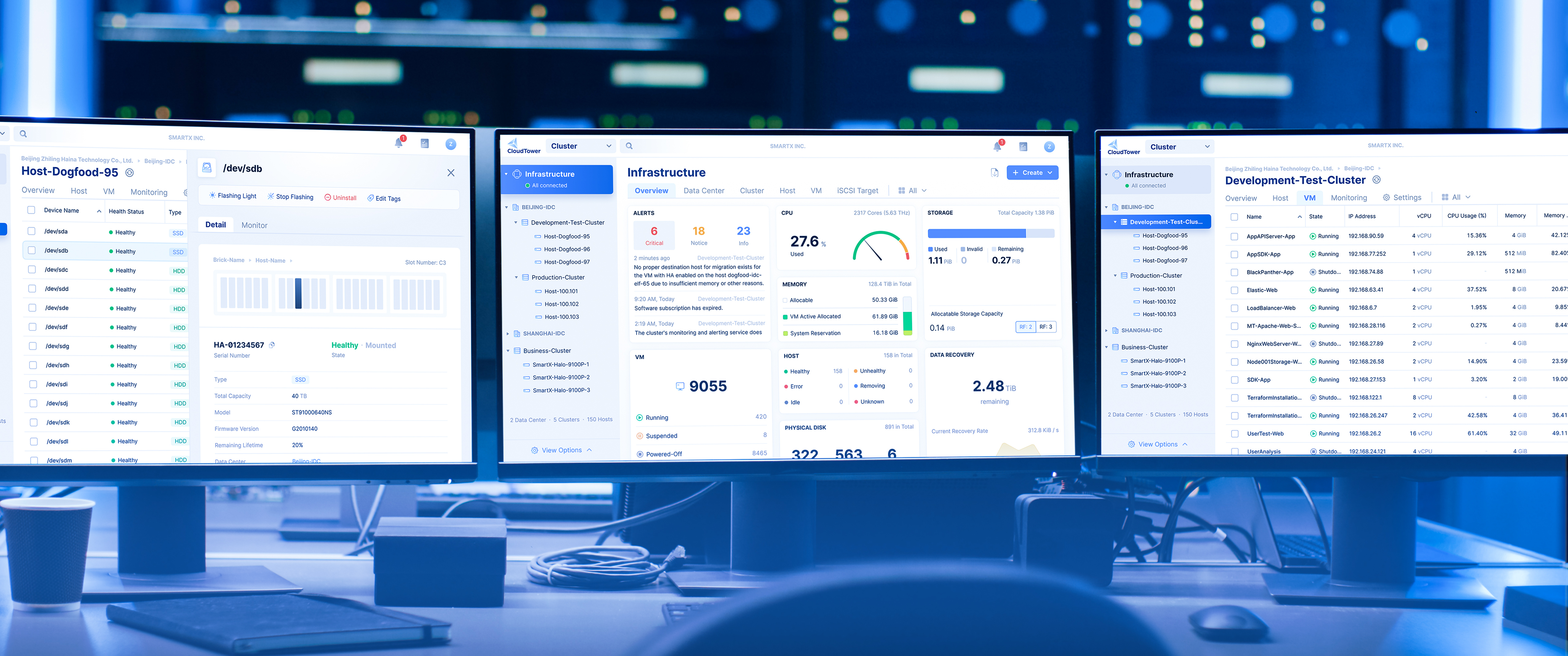
As the business expanded, the system scaled across 8+ product platforms, becoming a daily foundation for designers—and a shared source of truth for product managers and marketing designers alike.
It not only improved design efficiency and consistency, but also advanced collaborative workflows across product, design, engineering, and marketing. More importantly, it has evolved from a tool for designers into cross-functional infrastructure—actively used, co-maintained, and continuously refined by the entire team.
2 months
Completed core design system refactor
8+
Products and tools powered by the system
Products built with the CloudTower Design System now run in data centers.
Reflection
The evolution of a system begins with a shift in mindset—structure exists in service of service.
Redesigning the system wasn’t just about adjusting component structures. It was about redefining its role—from a product to a service. A system that adapts to people, not the other way around. This structural shift was grounded in a change of belief.
It also reframed my understanding of consistency. Consistency is not about control—it’s the natural outcome of enabling each role to perform their tasks smoothly. Structure takes shape to support this, and the system continues to evolve.
Form follows function.
In complex systems, form is not the starting point. It emerges from real usage patterns, role paths, and practical tasks—shaped bottom-up, not top-down.
Just as architect Louis Sullivan once said, “form follows function” (Sullivan, 1896), a design system’s structure should grow from need—not from pre-defined form.
Methodological Note
This project took place in 2020. Many decisions were made through observation, intuition, and critical reflection.
It wasn’t until my graduate coursework in systems thinking that I fully recognized what lay beneath: a network of causal loops and systemic tensions. What I had intuitively done back then was, in hindsight, a structural intervention.
This piece is a retrospective reconstruction—rewriting the story through today’s lens of complex systems thinking, to reveal the full picture behind the problems and ground the interventions in theory.
To my professors: thank you. Your work has made a lasting impact.
Reference
Meadows, D. H. (1999). Leverage points: Places to intervene in a system. The Sustainability Institute.
Rittel, H. W. J., & Webber, M. M. (1973). Dilemmas in a general theory of planning. Policy Sciences, 4(2), 155–169.
Sullivan, L. (1896). The tall office building artistically considered. Lippincott’s Magazine, 57(3), 406–409.